Branding • Packaging • UI/UX • Publication


BRANCH is a monthly issued Australian Arts Magazine targeted at art curators, art collectors and artists. The magazine contains a double page spread introduction (contents, editorial and imprint areas), 2x feature double page spread from the cover artist, 2 page artist review from the weekly support artists and double stock page spread containing works for sale from the weekly support artists.


My goal was to create an effective packaging design making consumers that suffer from sinus related health conditions desire their product. The new packaging is designed around making health information easy to understand, practical to open and approachable.


A leading design school offering a variety of courses across multiple design disciplines. The centre is creative, fosters innovation, provides education, enables professional development and has a diverse array of design disciplines. I was able to capture these key messages in my logo, pulling inspiration from the spatial dimensions of the classroom and the five courses the centre has to offer.


The National Institute of Dramatic Arts, NIDA needed their existing visual identity updated and applied across a range of collateral. NIDA wanted an original dynamic logo working across their education program and professional theatre venue along with fresh designs for the new season of theatre shows. I designed a new visual identity, stationary design, theatre posters for their new plays The Rise Of AI, Hamlet and the World Turned Upside Down and a theatre booklet.


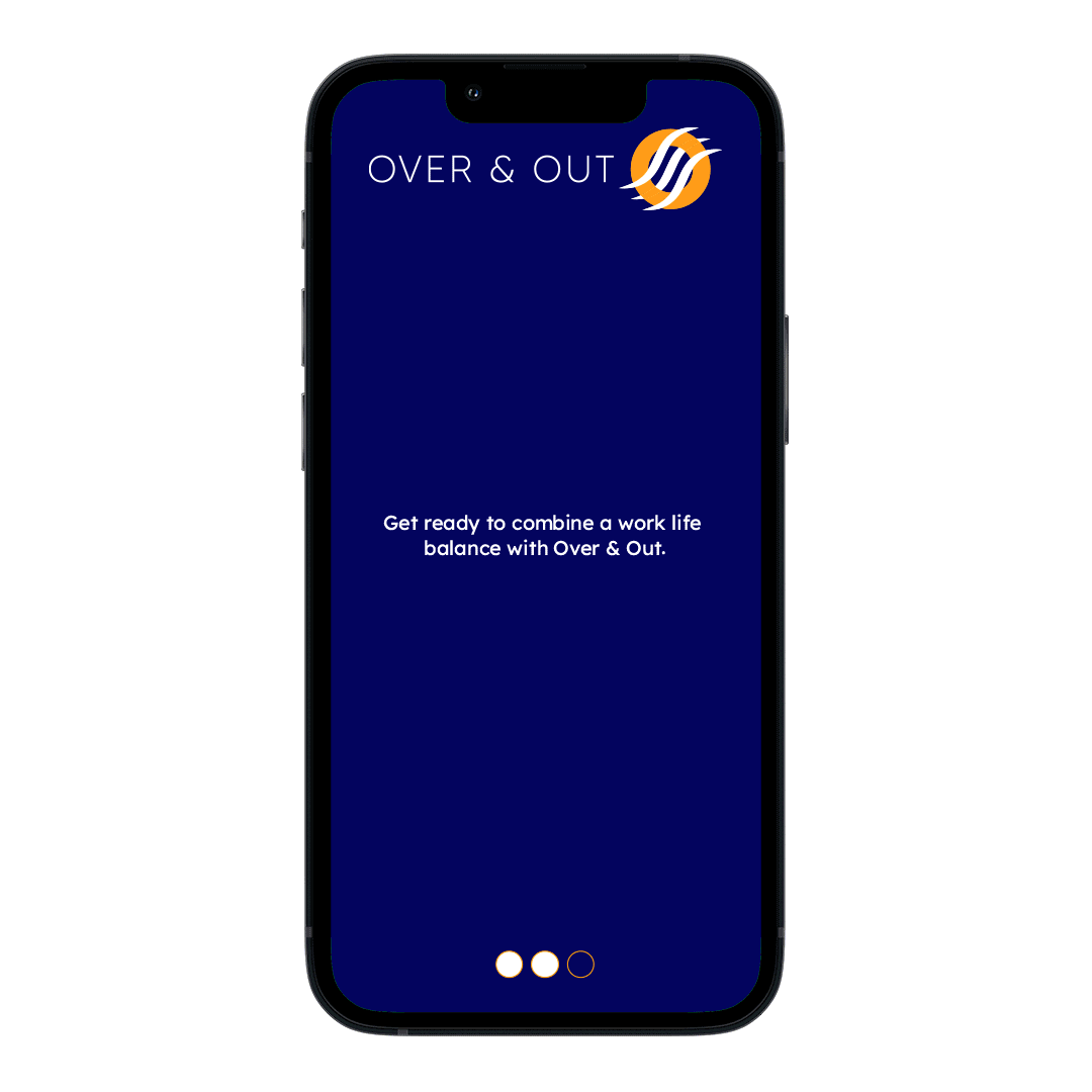
The new Western Sydney Airport needed a branded online ticket booking app for a new domestic airline carrier. The application is created for young professionals looking to get away for short domestic holidays. I designed the user flow to be functional, responsive and easy to use.