Branding • Packaging • UI/UX • Publication


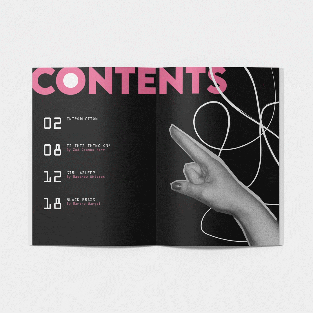
A new visual identity for NIDA Theatre, including logo design, season booklet, posters, and stationery. This visual identity is inspired by scrapbooking, as well as modern grungy graphic design.


A rebrand of Cobram Estate olive oil intended to elevate the current packaging into something more attractive. Informed by Victoria's rural countryside and rustic home kitchens.


An art & culture magazine designed for people aged 20-30 in the inner west and beyond. It has a focus on color and creativity and features bold graphic elements and original cover illustrations.


2nd Chance is a fictitious upcycling initiative that solves the issue of op-shops only selling 10% of what gets donated to them, with the rest going to landfill. 2nd Chance partners with Vinnie's to turn this excess waste into upcycled garments, as well as provide online tutorials and workshops to get more people involved in the upcycling movement.


A collection of my motion graphics work. Responding to a range of briefs, and using a range of techniques and skills.