Liam Leighton
I'm a designer, who develops strategic solutions and innovative concepts that stand out in the marketplace.

I'm a designer, who develops strategic solutions and innovative concepts that stand out in the marketplace.

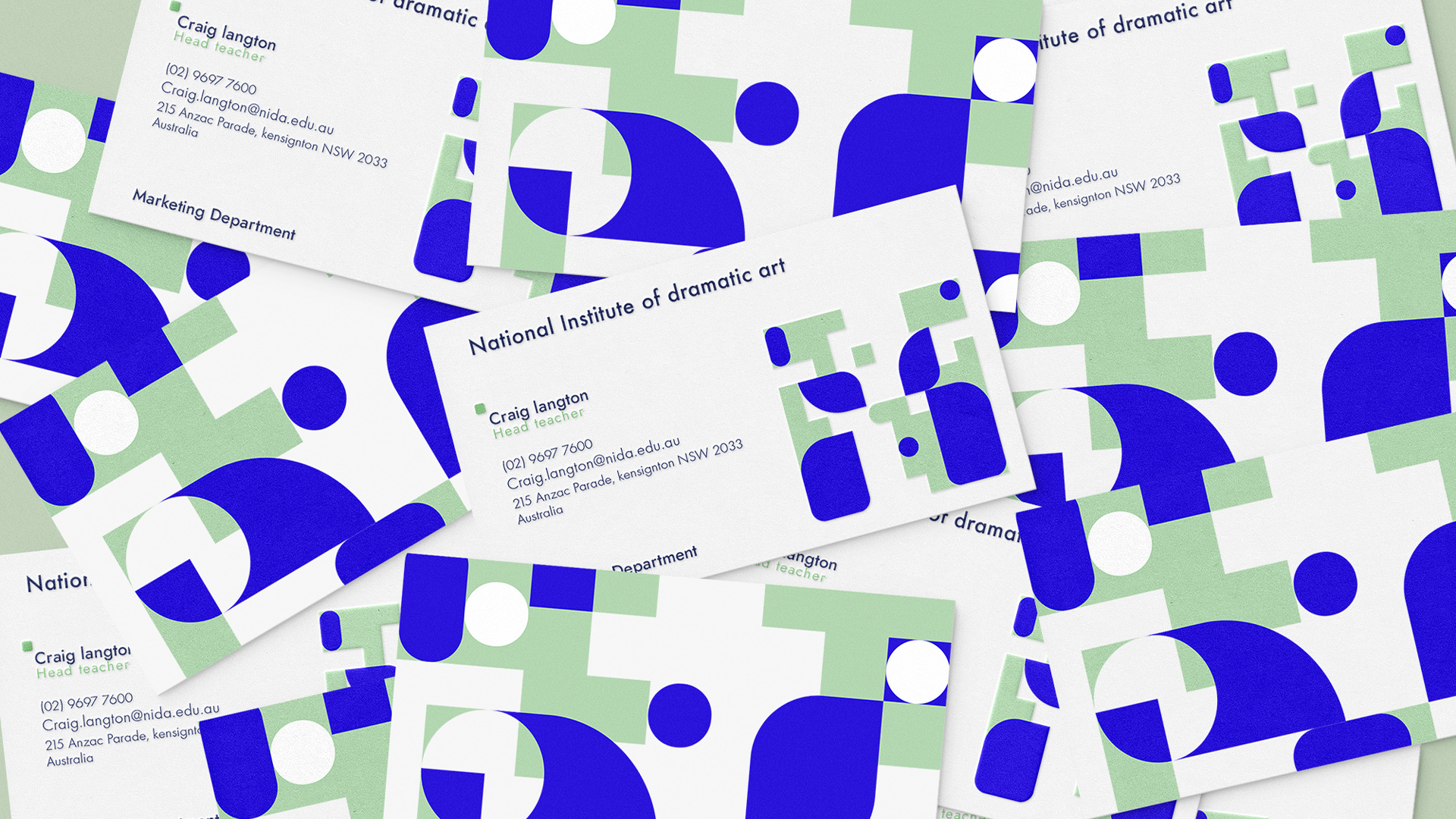
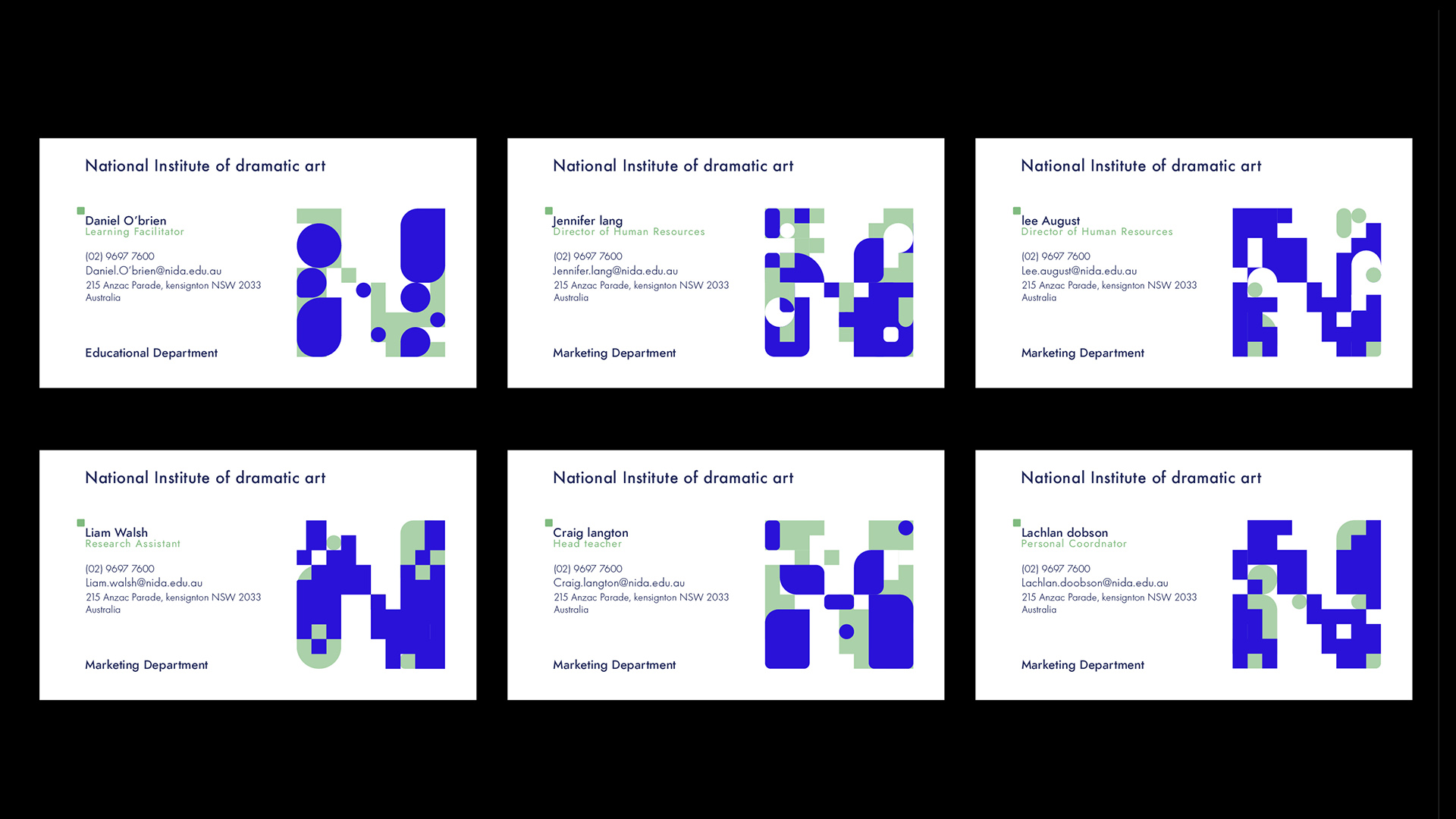
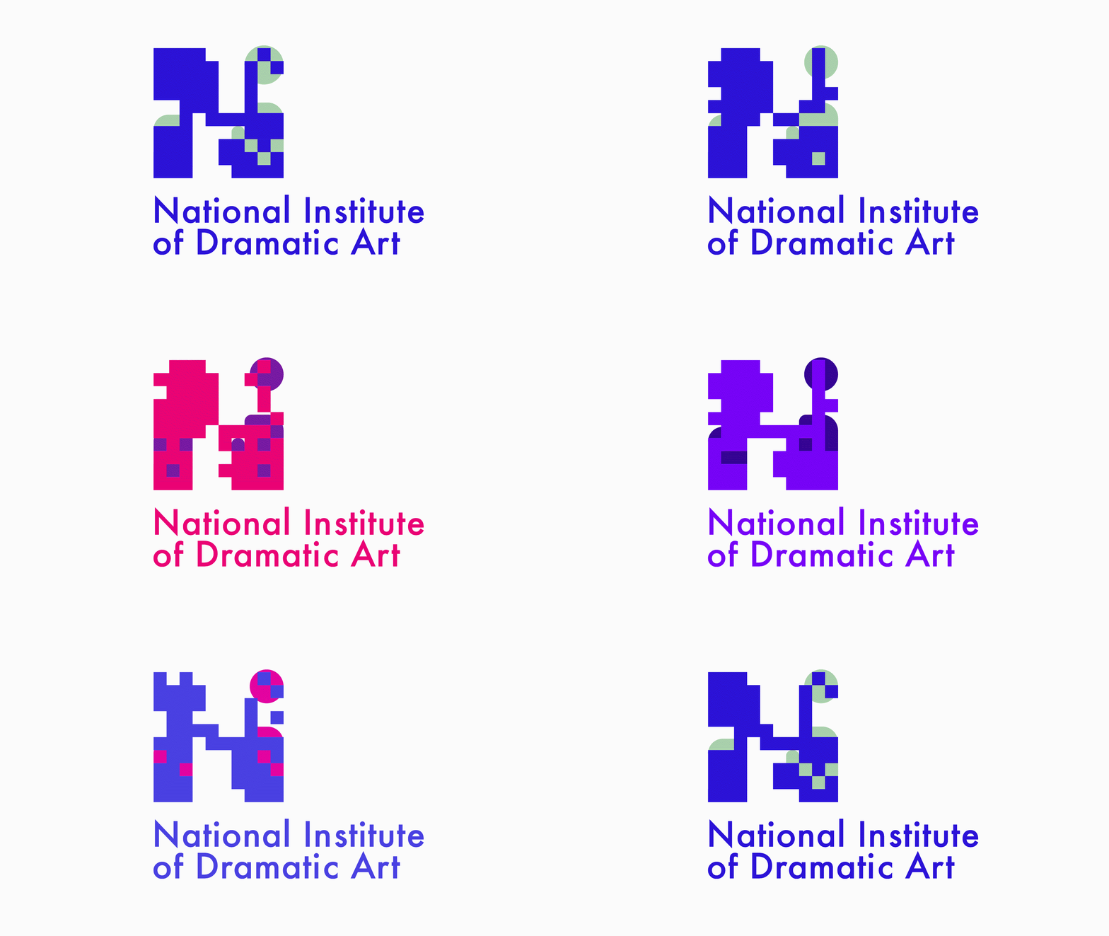
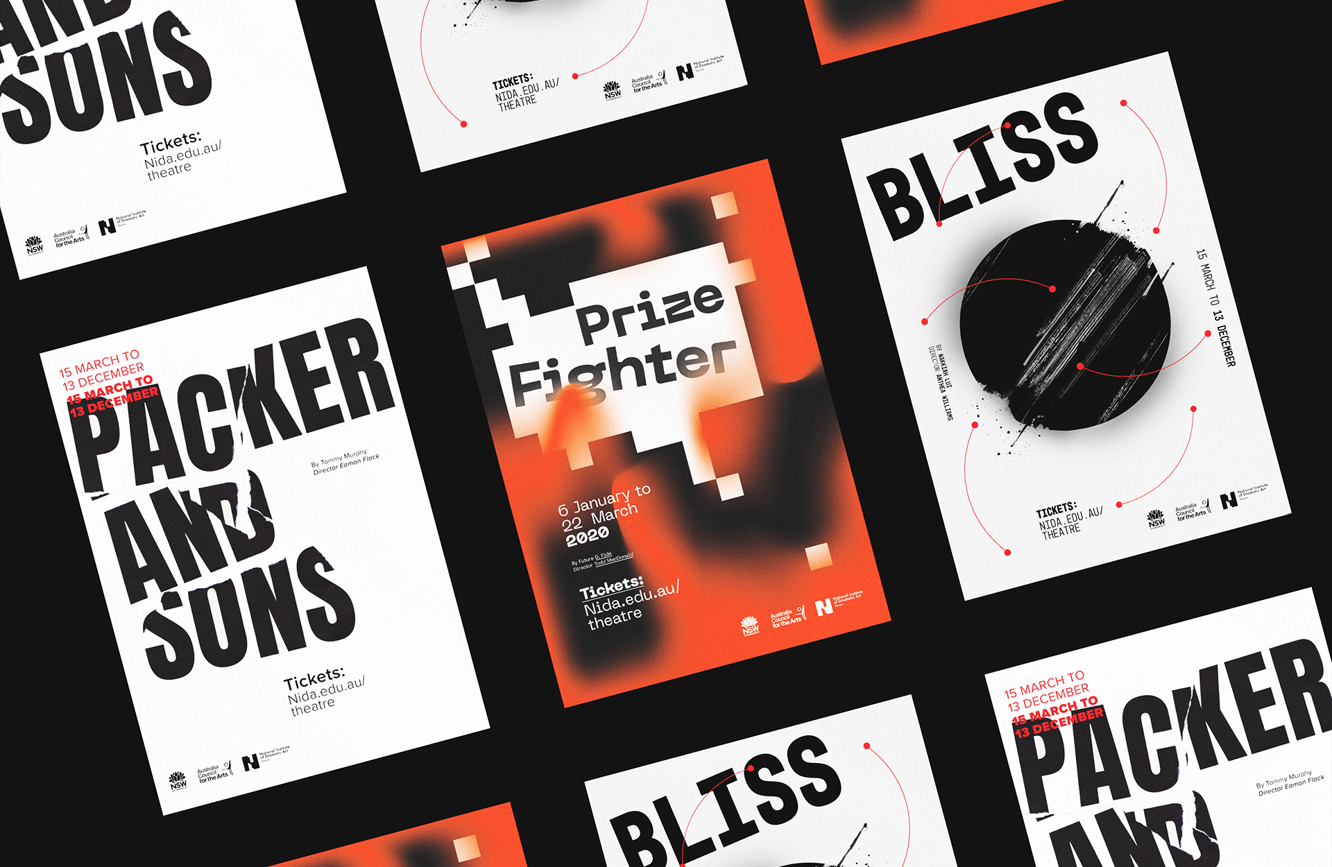
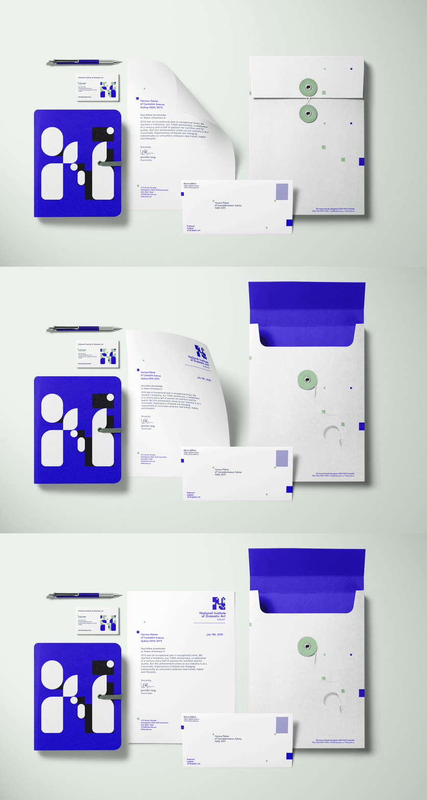
For NIDA's rebranding I created a dynamic logo, redeveloped a new visual identity and redesigned all collateral. The dynamic logo represents NIDA's different parts of the organisation, The logo has two distinctive components. The square blocks in the logo represent the learning curve seen from its students in the educational side of NIDA. While the free form, circular elements represent the emotive and theatrical side of professional performance at NIDA. These elements are used throughout the collateral to showcase a brand that is interchangeable, innovative and an educational powerhouse.
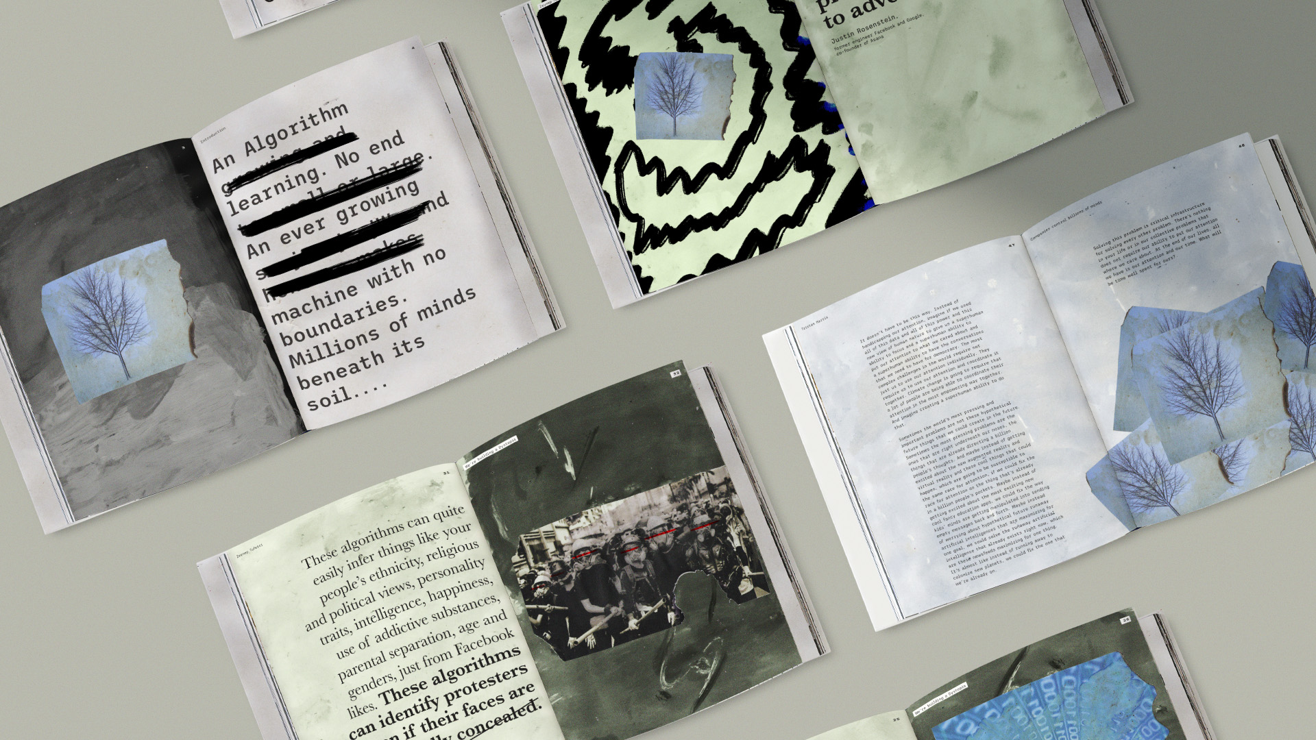
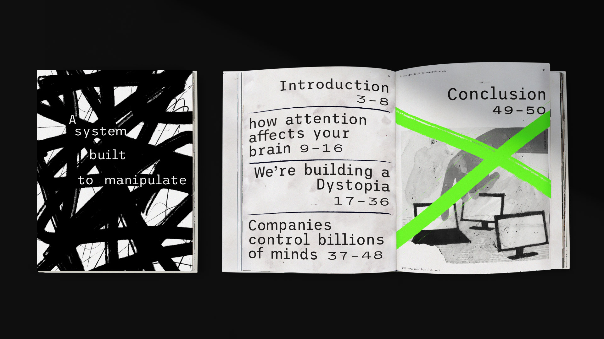
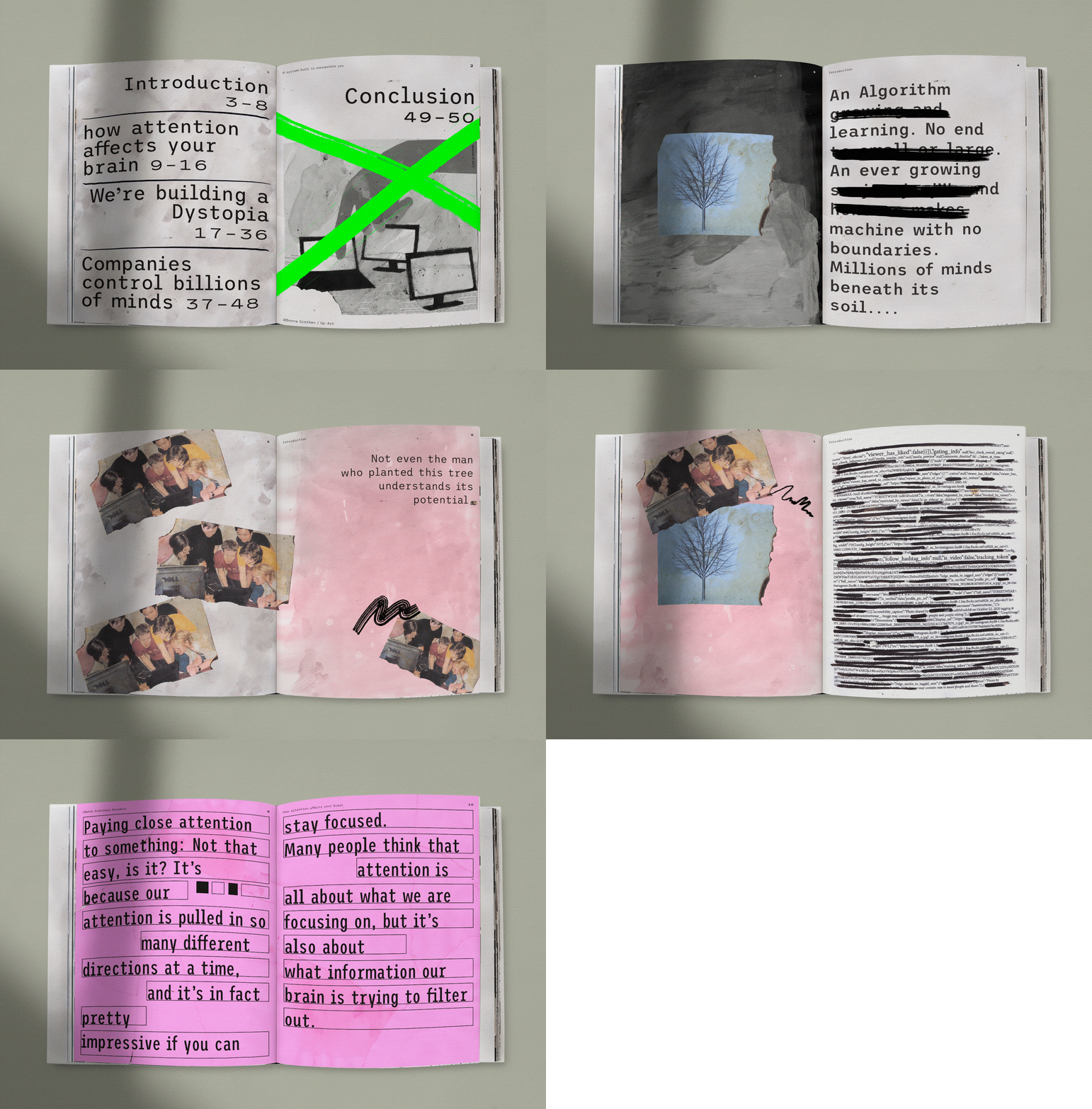
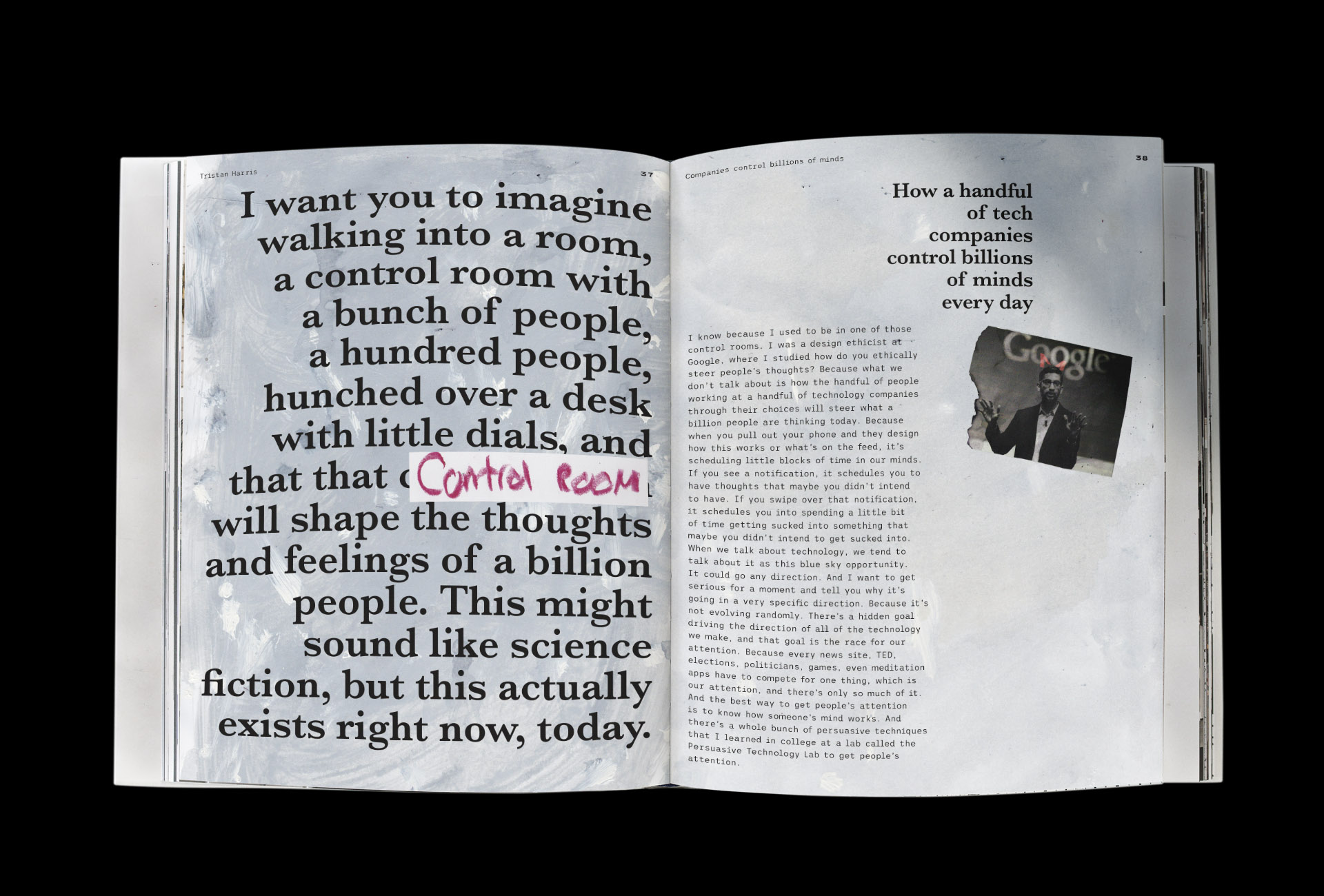
Developed a publication based on the playlist 'race for your attention' from Ted talks. The book's content was focused on how algorithms are used in social media platforms in destructive ways to manipulate and coerce the user/audience to engage with their product and benefit the advertiser. The design elements were raw and organic. The design highlighted the chaotic emotional response that algorithms are designed to evoke. A system designed to manipulate the general public.
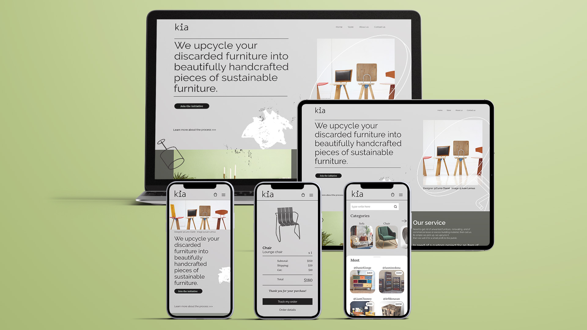
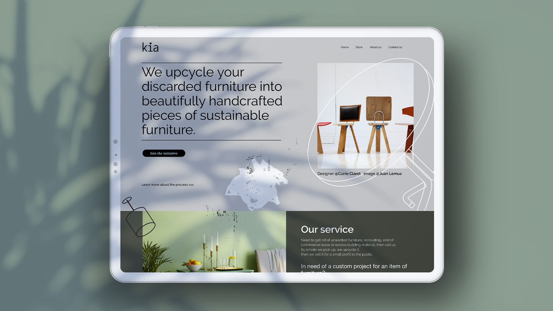
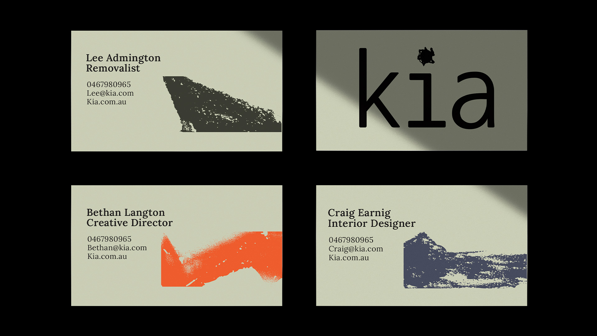
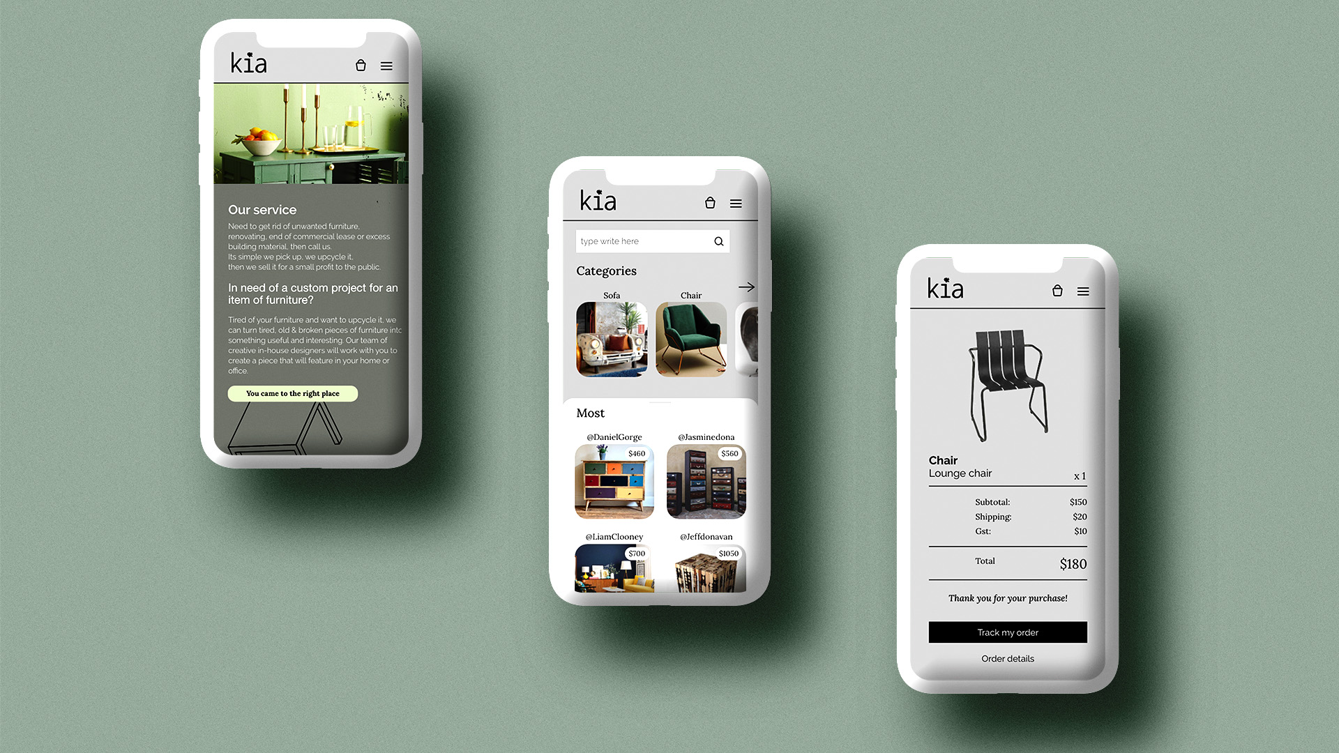
Developed a sustainable solution for the rise in fast furniture waste. What type of business model would work and offer affordable alternatives to Households all over the country? Created a theoretical company called KIA, which sourced furniture from the community, upcycled by inhouse designers. Creating new, handcrafted pieces of sustainable furniture. Designed elements that represented different materials that are commonly used in the fast furniture industry. Imperfection was a major element in branding to showcase the beauty of imperfection in furniture.
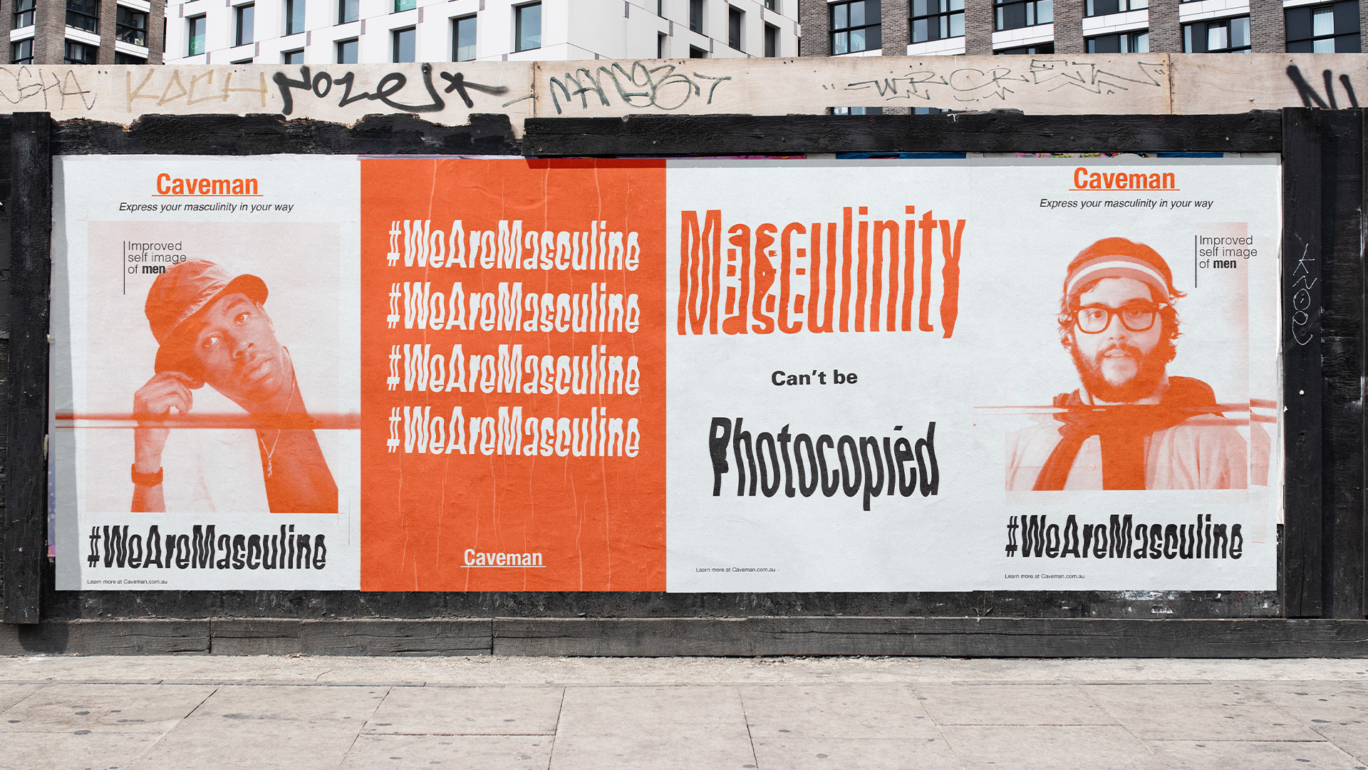
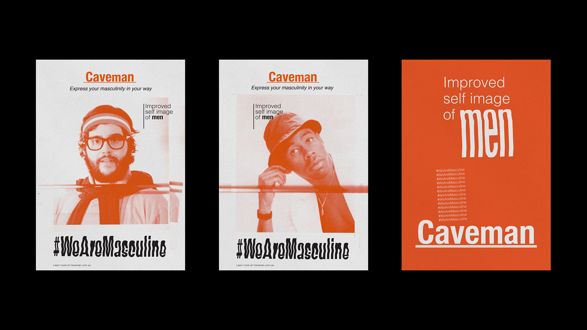
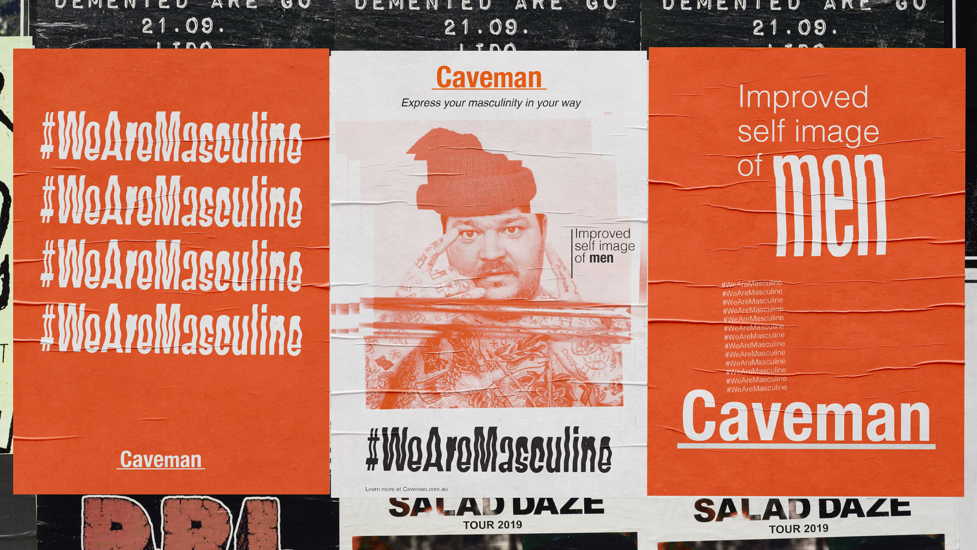
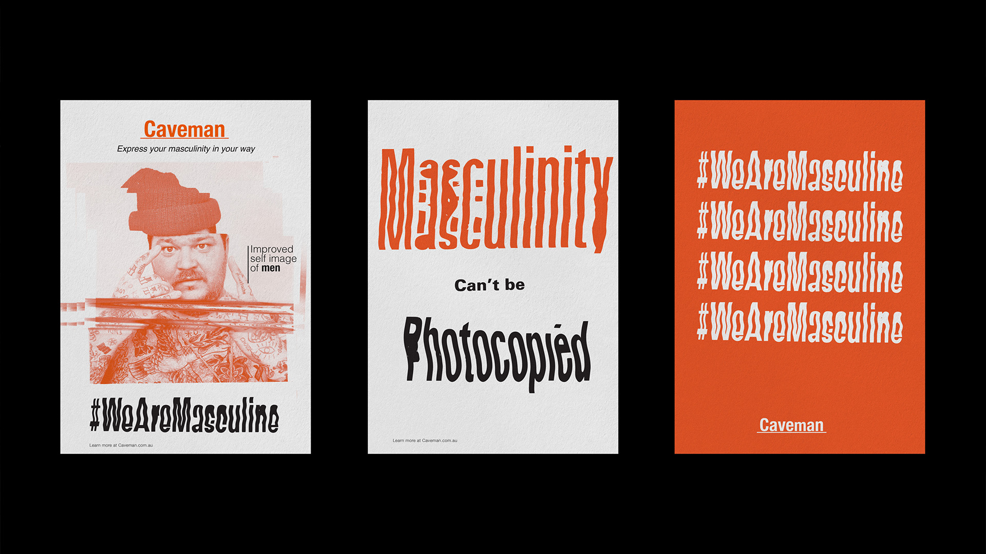
Created a campaign that generates awareness of issues relating to masculinity amongst young men in society. To discourage young men from measuring their self worth to external objects and instead look within. The campaign is based on the idea that masculinity cannot be photocopied and is unique to each individual. The imagery and type was manipulated to showcase imperfection. The colour orange is associated with enthusiasm, encouragement, happiness and health.
